the journey for a comfy steam
chasing the dragon of a console experience on PC
currently playing: tim wright - playstation 4 menu (ps4 system)
as some of those who read this may know, i am a decently proud owner of a steam deck. now, for most people, they're gonna get the thing, and just start putting games on it, and be done, just using it like that for their entire tenure. maybe they'll install emudeck and decky if they're a mildly more advanced user and/or just really liked seeing those twitter videos where people are running switch 1 games on the deck. and that's perfectly fine! hell, if by chance, you reading this fall into those camps, that's perfectly cool, and if anything, i mildly envy you. i wish i could just use the thing and appreciate it as-is, but there's so many little biting niggles with it, at least to me. i don't really like the new sound design that the deck ui brought with it - i much prefer the old, subdued, almost submarine-sounding steam big picture sounds that felt far more understated and less intrusive and therefore less likely to overstimulate and fatigue me. i'm not exactly the hugest fan of seeing the entire poster in the deck ui either. where i'm fine with it in desktop mode, as i'm likely examining my games a bit closer, in game mode, i just want to see as many of my choices as possible and not have their box arts take up a fair chunk of the screen. or, honestly, as somebody who used to be a ride-or-die playnite user, there are a lot of features that became creature comforts that i wish i could have in steam.
enter decky. i know that i mentioned it earlier, but by and large, most people who get decky are just doing it for the ability to install tools such as cryoutils (prehistoric gamer! this shit's been discontinued since like january of 2024) or powertools, will sometimes fiddle with it to get better battery life out of their games, and then leave it at that. no, i'm rather focused on a few specific addons, here. css loader, steamgriddb, audioloader, tabmaster, playtime, and howlongtobeat. this post is going to be a brief little walk through all of the things that i do with these plugins to make my steam-going experience better. notice that i generalise to "steam-going" and not just specifically "deck"... more on that later.
css loader
this is my meat and potatoes, and where most of my time is spent. css loader is a plugin that allows you to apply themes to your steam, much in the same way that skins used to work for it back in the day, or for a more console-oriented example, think the themes of the ps3 and ps4. yes, a fact that few may know is that the steam deck ui/game mode/big picture/whatever the hell you wanna call it, is all just a big old html page. much like this very post! thus, with it being html, that likewise opens it up for the same css stylings as any other html page. of course, there's a lot more to specifically target with - you know, fuck it, for brevity and simplicity, the ui is hereon referred to as 'bpui' - there's a lot more to target with bpui, such as your game posters, the top and bottom bars, the menus, the game pages, hell, even down to the little button prompts. but that's precisely what makes it so compelling to me. there is such a heaving load of granular choices to be made on precisely how you want every little last tiny element of bpui to look, and thankfully, if you're an untalented piece of shit like me, there's a lot of people who have already done the heavy lifting for you so you can just play around with a bunch of sliders and hex values to get things looking neato!
take for instance, something as inoccuous as bambusbruder's 'ethernet icon'. what does it do? well, there's a little wi-fi symbol in the top bar of bpui. this css theme simply changes that icon to an ethernet icon, and you get a choice, either the android ethernet icon (which i didn't even know existed until i saw this theme for the first time), or alternately the nintendo switch's ethernet icon. it's a tiny touch, sure, but it is something that makes my brain sing. i get to see that i am connected over ethernet being reflected in my bpui. similarly, i am a big shooter for 8bitdo's lineup of controllers. well, how about a theme, 8bitdo controller glyphs by deckfilter, that allows me to replace the xbox 360 controller glyphs with the 8bitdo controller glyphs? or how about this - do you wish that the little profile icon in the top right corner was circular and had a little border around it that was color-coordinated to your current online status on steam? well, avatar customization suite by charmics has you covered! this goes deep! there's a bunch of these little tiny ones that make admittedly, miniscule changes, but they're miniscule changes that make a difference to somebody as entrenched in this sort of reach for perfect aestheticism as i get when customising these things. but let's take a step back - what about some bigger picture shit?
yes, of course, as much as there are the little things, there's also no shortage of transformative ones - take for example, art hero by metagawa, which brings the recent games carousel down to the bottom of the screen and so obscures the recent news section beneath a down press, and with the extra space displays a big version of whatever steam hero you have set for any given game you hover over? and additionally, what if you want to see even more of the posters whilst you're at it? just go into its settings and disable the footer, or make it transparent. you can have complete granular control over the positioning of both the hero image and the carousel, as well as how they're layered; it's a super in-depth one, and it's one that i'm a great fan of. likewise, there's catppuccin, by ozwaldorf, luna-terra-cg and soradotwav. i am already a biiiig shooter of the catppuccin color scheme - in fact, this very site you're on right now is using that color scheme, specifically catppuccin mocha - so this was a shoo-in for me. what i wasn't expecting was it to be, again, heavily granular. you can pick which flavor of catppuccin you want right from the list, what accent, whether you want to theme the keyboard, play button, even down to the controller glyphs, there's a whole lot! and then, the piece de resistance, what if you want your shit to just straight up look like a switch or switch 2? well, within somewhat reasonable constraints, that's where something like mipai's switch deck 2 theme comes into play - and speaking of getting things to look a bit more like the switch...
steamgriddb
now, steamgriddb is already a name that's at least decently well known, for their database of user-created steam library assets. i, myself, uploaded a great deal of square-grid images. now, why would i do that, when the steam default is rectangular? well, that's just the default. steamgriddb's plugin for bpui allows you to set your games to adhere to a square shape instead, and whilst i am so sure that i'm being so nitpicky and granular about this, i so so much prefer this look. i don't know; personally, seeing the banners on steam, whilst certainly nice, almost makes me think of them being closer to scrolling through netflix or something. and unlike seemingly ever other fucker under the sun, i don't want my games to be more like movies - i want clear distinctions between them in my head. and so, having a clear visual indication that my games are squares, and that when i boot up Totally Legitimate Viewing Softwares later, my movies and shows will be rectangular, and then when i boot up foobar2000 my disc art will show in circles, i enjoy it. i am deeply entrenched in this level of... yes, superfluous and meaningless customisation, but i do like my little tweaks to provide further comfortability.
but, hark! you may shriek, oddly, because it's 2026 and that is vernacular that i don't think has been in rotation of most people since, what, the early 1900s? hey! you correct yourself to. how do i go about replacing all of those now unfitting grid images? well, that's where steamgriddb also has you covered! remember how there was like, a whole-ass website and shit full of those library assets? yeah, the main actual point of the plugin is to integrate the ability to search for those into bpui! it's as simple as pressing start and going to change artwork (or like, ctrl+0 if you're using a keyboard), and it'll automatically search for your game and show you the results! now, of course, if there's none on the website in the aspect ratio you've chosen, whether it be the default rectangular shape or the suave square, you're a bit shit out of luck, but that's what resulted in me cranking out 54 bloody grids in one day - once you square, you'll never want to go... back... there? fucked if i know. point is, if you have an eye for it, you can simply open up something like paint.net (other image editors are available), re-crop the default steam grid and then upload that to steamgriddb's website so you, and whoever else may want to use it in the future, can apply it to the game! for example, i truly do not like the western cover for knuckles' chaotix - the japanese one is so much effortlessly cooler with its sleek confidence. so i simply just cropped the japanese box-art, generously already uploaded in rectangular form by another user, and made it into a square. it's awesome! can't lie though - after doing about 10, i had to take a break because my feeble little body could barely hack it. thankfully a fair majority of my games still had squares available. yeah, 54 is barely even a drop in the bucket when it comes to my library. i am a digital hoarder!
so, we've got our aesthetics down. the look of the launcher itself, and the box arts are all in order. now, to sort out that bloody tinnitus-causing shite that is the audioscape. no shade to valve, they're perfectly cromulent sounds, they just irritate me specifically. that in mind:
audio loader
now, this one is a rather simple one to explain: on deckthemes.org, there is a database of audio, both sound effects and background music. you can choose from any which one of these that you may desire, and people have uploaded tonnes. there was a while there where i was running with the sonic unleashed ui sounds, the sonic mega collection ui sounds, the undertale ui sounds - there's a lot of games' ui sounds that have been ported, as you can imagine. i've eventually settled on the largely minimalistic nintendo switch sounds. their simple little chimes and noises are something that's never offensive to my ears, no matter how many hours deep into a blinding migraine i am. but, before that, i used to use the ps3's xmb sounds, paired with the ps4 system menu theme - the one you're listening to right now, matter of fact. i found this to be a serene mix of being aware of my every little action whilst having it still be a pleasant enough soundscape. the reason that i switched from that specific pack of xmb sounds though is because one, i couldn't really find an ideal volume, because due to their high-pitched nature, i could sometimes be a little too sensitive to them, but then if i had them too quiet they'd be effectively useless because it was like trying to listen out for a dog whistle, and two, the sound pack of them that i was using was unfortunately incomplete and still used some of those default steam sounds and when they reared their head, they would blow up my head. but you can experiment! i had a deltarune themed one, with the sound effects using deltarune's ui sounds and the song playing in the background set to welcome to the green room, and that was a biiig shooter for a solid bit there. funniest part about that? it was that version of welcome to the green room from the website before chapter 3 even released, i just remember hearing it and wanting to hear it on loop because it was so utterly serene. a great many times i just left my steam open and listened to it to go to sleep at night. hell, maybe you want to indulge in the experience i outlined at the top of the article, and revert the soundscape back to the older (frankly superior) big picture sounds? go for it!
tabmaster
alright, so, you've gotten all your games looking spiffy, and it's not an assault on the eardrums to browse them anymore. next up, let's do something about the library tab!
one of my biggest criticisms of default bpui is just kinda unintuitive the tab situation is. first, if you've got a controller connected, it spawns a new, exclusive tab labelled 'xbox controller' (seemingly it does not matter what type of controller you've actually connected). in here, you have games that are listed by steam's controller compatibility checklist, which itself is a whole other confusing can of worms but the top and bottom of it is that by and large, it is prone to error. and quite a lot of the time, too. similarly, the 'great on deck' tab reports on valve's own steam deck compatibility settings. this, as i'm sure that many deck owners will tell you, is usually a complete crapshoot. their ratings are heavily unreliable to a point where consulting a third-party site, such as protondb, is by-and-large recommended for actual field results from user reports that you can then read through yourself. next is the 'installed' tab which just makes my fucking brain hurt. okay, so it doesn't actually list all of your installed games, as you would think, rather, it includes only your steam games that are currently installed. so god forbid if you wanted to scroll through all your games in one coherent list. no, that's where the 'non-steam games' tab comes in, to hold all of your (you guessed it) non-steam games. i cannot stress how clunky this system is. in fact, it was so utterly baffling to me that before i knew about decky and all that, i just made a steam collection to hold all of my deck games, steam and non-steam, and just clicked on that whenever i wanted to browse - thankfully the 'collections' tab is the one that i don't have any qualms with, other than the fact that it can get a bit laggy if you're obsessive-compulsive like me and have literally every series that you own multiple games in be signified by a collection. finally, last and least, the 'soundtracks' tab. i want you to find me one person who can earnestly say that they have used the soundtracks feature in steam since like, 2015. i used to use it before the half-life and portal soundtracks were readily available on streaming (or more realistically, before i just downloaded them in .flac myself), but now this feature is so utterly useless to me and i'm sure countless others, and yet it has to take up a whole tab of its own on the end. for what bloody purpose?
enter tabmaster; you can immediately start with this plugin by hitting start when hovering over a tab, and clicking 'hide'. goodbye shitty tabs! then, you can create new tabs of your own; create an 'installed' tab that actually holds all of your games as opposed to arbitrarily separating them. point to a pre-existing collection in your library to make a tab out of, perfect for keeping your currently played and backlogged games to hand. have some apps added in your steam that you don't want showing up amidst your games? use the blacklist feature to exclude certain things from showing up in those tabs - god knows i don't want youtube, jellyfin and kodi showing up in my games list. if there's one plugin to get out of this entire lot that i'm discussing, it's this one. it alone elevates bpui from a library of cumbersome navigation into a sleek, elegant console-like experience. my personal setup for the longest has been: apps, installed, playing, backlog, collections. this is just one combination that could be used, but the sky is the limit, really. you can get really granular with it.
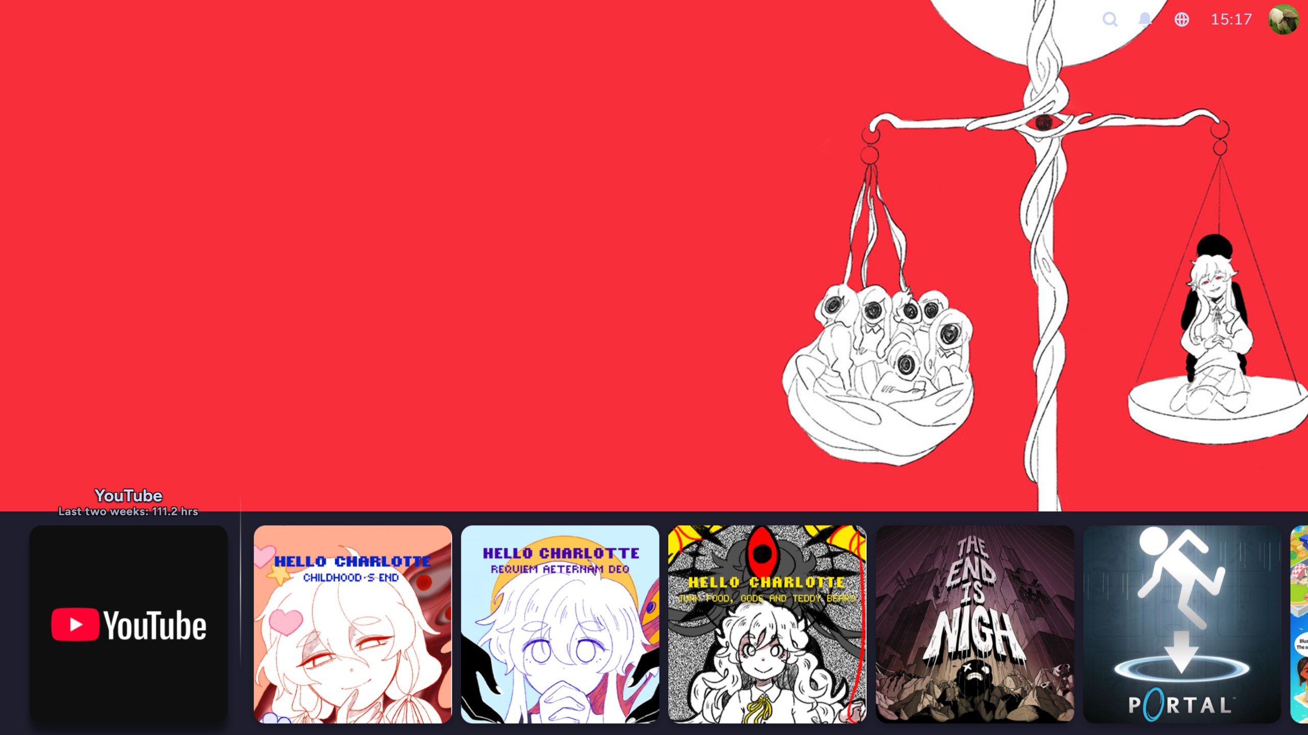
playtime
so you've beautified your library, made it sound nice, and now it's not a pain in the tits to navigate. but there's one thing - your non-steam games don't have the little 'hours played' text next to them. that's a bugger. i know for a fact that i've probably got 300 youtube hours in the last two weeks because i keep falling asleep watching old ashens videos, so let me see that shit. fear not, my friend! playtime keeps track of your playtime in non-steam games, but as an additional bonus, also shows you a comprehensive breakdown of your playtime across all your games over a specified period, from the day, week, month, year or all time. i find this to be a greatly handy thing, and also a great way to show how my disability has opened an avenue for me to just spend most of my time yes, bedridden, but also still enjoying it by playing games, and just how much time i can spend doing so.
conclusions, and the secret from earlier
so, overall, i think that these are the bpui addons to make your shit a lot more fly. lot more usable. at the very least, it ensures me less migraines. there are a litany of steam deck addons available, and hell, even just in css loader alone, there are hundreds of options available to a point where i have not even begun to breathe near the surface, let alone come close to scratching it. it's a bloody ocean out there, and one i would encourage you to look into yourself if you have any interest. but you may not have a deck with which to look into this. fear not, for here's what i wanted to get onto earlier: decky is also available for windows, and is how i predominantly use my whole-ass PC now. yeah, i just have most of my stuff added into a decky-customised steam, and will just use it as though it's a console. vacuumtube for a youtube console experience. kodi for a netflix console equivalent (thank you for controller support!). i'll add firefox (actually i use librewolf but mnehhh) with a custom controller profile to browse the web. discord is set to autostart with my pc, but to control it, i have a desktop controller profile that allows me to move the mouse to click on voice channels and shit. it's an amazingly convenient and comfortable setup for somebody like me who spends most days bedridden. you don't have to compromise on the customisation and usability of a pc to get a comfortable experience.
i rock a pretty beefy pc that's just on the cusp of being a bit better than a ps5, and having a user interface that is as comfortable, if not more so, is greatly welcoming.
for those looking for desktop mode customisation, i could point you in the direction of millennium... buuuut it's buggy as all fuck and crashes every two seconds in my experience, so i'd instead point you towards the aforementioned playnite. playnite is a unified launcher, so it detects all your games from all platforms on your pc, including steam, epic, battle.net (lol), origin, ubisoft connect, and there's more through community-created addons. not only that, but all of the things and more that i have cited as plugins in bpui are available for the desktop mode for playnite. the only reason i don't use it for everything is because its own fullscreen mode, the bpui equivalent, is sort of really shit. i've not found a skin that i click with, and a lot of features are often compromised or outright non-functional. its swings and roundabouts really.
in conclusion, though, my main point of all of this - please, for the love of god, do not settle for defaults if you don't like them. there's worlds of custom shit out there, custom shit that used to be integrated into these sorts of applications, but now they're hidden. the means to get to them are still present, though, and i would implore you to explore around a bit if this has in any capacity intrigued you. thanks for reading this great big rambly ramble.
and as an extra rambly ramble for those of you who stuck with me for so long...
console interfaces fucking suck now
yeah, so, i made that previous comparison to the ps5... that shit blows chunks. its very rigid, its not got themes despite even the relatively locked-down ps4 having them, and just generally speaking has far less personality. take this against the prior ps4, or god save you if you take it against the beautiful ps3. themes, sometimes even including unique sounds, icons, backgrounds, music, brimming with little easter eggs, and you can make for a system that can feel two different beasts altogether depending on who owns it. i remember i got so used to the sonic cd ps3 xmb theme for, like, a solid two years to where it was a lurch going to a friends' house and seeing theirs, which was like, plants vs. zombies themed. but i like that lurch - i like two different people being able to have their consoles speak to their interests, have a bit of a story to tell. the xmb is definitely the cream of the crop in this regard. but even then, there's just been a fall-off in the more bespoke, intricate and unique designs of years gone by; the wii menu's beautiful channels, the xmb's afore-glazed sleekness, or even the multiple different dashboard iterations of the xbox 360. all of them communicated different things, arguably felt suited for different demographics. the wii spoke its philosophy of making the wii remote feel like a universal tv remote by making the menu appear as though it was a large bevvy of channels being monitored, and you only needed to point at them and hit a to access them, complete with a little jingle and a banner image when you did so. the xmb carries this smooth confidence with its understated noises, only carrying a music track when you hover over a game, as its corresponding image (or animation in some cases) appeared to immerse you before you even begun playing. with the 360, no matter which iteration, there was always a focus on each of the screens having equal importance to one another, especially emphasised by my favorite, the blades dashboard. each of these yells the names of their consoles to you - its etched into your mind.
they already began to suffer with the 8th generation - the wii u and ps4 definitely held in there (especially the wii u but that's a story for another day) - but we already had seen the xbox side of things fall off. it was just the same design sensibility all of microsoft's shit was going for then, that is to say, glass panes with bountiful ads on a full-price system. and so, the others slowly pivoted towards it too. nintendo thankfully, fucking mercifully doesn't have the gall to advertise directly to you on the main screen just yet, but in turn you get what is by far the least compelling interface. just squares on an entirely blank background. i've already said about how i enjoy the soundspace, but the aesthetics otherwise leave a lot to be desired.
i miss when these things were something to be considered and be actually poured over, as opposed to now, where they are a reflection of the same soulless focus on functionality that has befallen a lot of the industry. dramatic, but its a phrase i find no less true for calling that out.